

 By Emmanuel Bamfo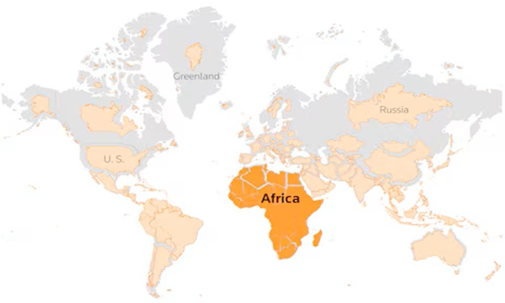
If you grew up staring at standard geography posters in school, your whole life has basically been a cartographic lie.
The United Nations General Assembly officially voted to phase out the 16th-century Mercator map in favor of equal-area projections like the Equal Earth map, revealing Africa’s massive, true physical size.
I stared at wall maps throughout my school years believing Greenland and Africa were roughly the same size, so seeing them side-by-side on an equal-area map completely blew my mind. Everyone knows that maps shape how we see global power and geography, but most people do not realize how badly our classic classroom map distorts reality. Let’s look closely at why the UN took this historic step, how the Mercator map tricked us for centuries, and how massive Africa actually is.
To understand this historic shift, you have to look at how a 1569 navigation tool ended up running our geography classrooms for 450 years. Flemish cartographer Gerardus Mercator designed his map specifically for ocean sailors using compasses, intentionally stretching landmasses near the poles to keep navigation lines straight.
Have you ever tried flattening an orange peel onto a table without tearing or stretching it? IMO, that simple mathematical puzzle explains why flat maps always distort something—whether it is shape, distance, or size. Mercator preserved accurate compass directions, but his trade-off massively inflated northern nations while shrinking equatorial regions where Africa sits.
Here are the main issues with the old Mercator map:
-
Extreme polar inflation: Regions like North America, Europe, and Greenland look unnaturally huge.
-
Equatorial compression: Vast continents like Africa and South America look drastically shrunken.
-
Distorted perception: Generations grew up with a subconscious, eurocentric view of world geography.
How Big Is Africa in Real Life?
So, how large is the African continent when you stop stretching the northern hemisphere? Africa spans an incredible 30.3 million square kilometers, making it roughly 14 times larger than Greenland.
When you look at the Mercator projection, Greenland and Africa appear virtually identical in size on wall posters. In reality, Greenland is roughly the size of just one African nation—the Democratic Republic of the Congo.
To grasp Africa’s mind-boggling scale, cartographers like Kai Krause created visual overlays showing what fits inside its borders. You can comfortably pack several major global superpowers into Africa’s landmass with room to spare.
-
United States: Fits fully inside the continent’s northern region.
-
China and India: Tucked comfortably into central and southern regions.
-
Eastern and Western Europe: Fits alongside Japan and Mexico without overlapping.
Does anyone actually realize you could fit the entire continental US, China, and Western Europe together inside one continent? Probably not, which is why adopting equal-area maps like the 2018 Equal Earth design matters so much for global education.
You might wonder how this new map fixes centuries of cartographic distortion without ruining the view. Created in 2018 by cartographers Bojan Šavrič, Tom Patterson, and Bernhard Jenny, the Equal Earth projection accurately represents the true relative surface area of every country.
Unlike older attempts like the Gall-Peters map—which stretched continents into awkward, droopy shapes—Equal Earth keeps landmasses visually pleasing while keeping mathematical areas exact.
-
Preserves true sizes: Every square inch on the map represents the exact same real-world land area.
-
Maintains natural shapes: Curved sides give the map a rounded, globe-like appearance without extreme stretching.
-
Restores visual balance: Gives Latin America, South Asia, and Africa their rightful prominence.
While changing wall maps in schools might sound like a simple academic update, it carries massive cultural weight. Fixing geography maps undoes subtle cognitive biases that have visually minimized the Global South for centuries.
I remember discussing global trade with a friend who assumed Europe was physically larger than Africa simply because of classroom maps. Correcting that basic mental image changes how we view population distribution, climate impacts, and economic potential across developing nations.
Here are three practical ways we will see this map change roll out:
-
Updating school textbooks: Classrooms worldwide will phase out outdated wall maps.
-
Digital platform shifts: Tech giants and news outlets will adopt equal-area defaults for global graphics.
-
Rethinking global policy: International bodies will visualize global data with accurate spatial representation.
What Lies Ahead for Digital and Classroom Maps?
Spearheaded by Togo and backed by the African Union, the UN’s “Correct the Map” initiative is gaining massive momentum. Countries like France have already committed to dropping the Mercator projection in favor of equal-area models.
Will tech giants like Google and Apple update their default desktop map settings globally? FYI, while Mercator stays in place for sea navigation and aviation, everyday digital views are moving toward true-scale representations fast.
Also Read: Kennedy Osei Nyarko calls for category a shs in every mmda/